10 years of Apple text editor solo dev 👨🏻💻
In 2015 I was a regular full-stack web developer (and still am to this day). I’ve owned a Mac. I’ve built a tiny iOS app once. That was about the extent of my proximity to the world of Apple dev at the time.
Having spent some time behind a Mac, I’ve grown fond of its quirky and vibrant ecosystem of indie apps. One day, after stumbling upon a very simple and elegant Markdown editor called iA Writer, for one reason or the other, I decided to make something similar.
Armed with enthusiasm, I started learning how to make a native text editor for the Mac. Xcode, AppKit, Objective-C — all of it was new to me and not something I would ever find use for at my day job. I had to learn a completely different tech stack that would live inside my head parallel to all the web knowledge.
At some point, I started calling the app Paper because, in pursuit of ultimate minimalism, I’ve reduced the editor to nothing more than a blank rectangle. To top it off, I’ve made the corners 90° instead of the typical rounded ones. Silly? Maybe… But it was my app so I could do whatever I wanted. 😈
In January 2017, 2 years after starting from ground zero, I launched the Mac app on the Mac App Store. The iOS app followed in 2019.
Now, it’s not every day that a random, unknown web developer decides to build an app in a ridiculously crowded category, in a tech stack they have no experience with, and then actually does it, carrying on for the next 8 years. “There’s gotta be some good material here” — I thought to myself.
And so — here is a brain dump of all the weird, bizarre, and occasionally smart ways that I’ve organized my dev process, app architecture, and product philosophy, coming from a web developer who has not earned a cent working at a job as a Mac or an iOS developer but has earned quite a few of them selling a native text editor to the users of Apple devices.
Why native?
You could make the argument that an Electron app would work as well. Why go through the hassle of learning a brand new tech stack especially when my main job is web-related? I could have reused the skills, saved time, and supported more platforms all at the same time.
Well, my goal was to deliver the best experience possible. I was trying to compete with highly polished writing apps, thus my app had to be light and fast to begin with. In addition to that, there are simply more ways to mess with the app on the native level — to make it unique (especially when it comes to text). I was not trying to reach the maximum number of users nor to cut down the development time. I had all the time in the world. I was trying to craft an experience that starts with lightning-fast download time and carries on into a native-feeling UI and UX.
I wanted the best and I was willing to pay the penalty.
Why Objective-C?
In 2015 Swift was just getting started. I decided to make a test. I’ve compiled an empty Xcode project in Objective-C and another one in Swift and then examined the respective .app packages. To my surprise, the Swift one had the full Swift runtime embedded into it — about 5MB, while the Objective-C one was super light — tens or maybe 100KB in total. That was enough to convince me to go with Objective-C.
Again — I wanted the best and I was willing to pay the penalty of a harder-to-learn, soon-to-be outdated language to get a slimmer distributable.
To be fair, if you run this experiment today the difference will not be that dramatic. Swift has come a long way and is now part of every platform.
Third-party dependencies
Paper does not have third-party dependencies.
I had little trust in my ability to pick the right dependencies from an ecosystem that I was not familiar with. Plus by building everything on my own I could tailor it to my needs, gaining a slight advantage over competitors who often rely on external dependencies even for core parts of their apps.
For example, the Markdown parsing engine in Paper is bespoke. Why is that a good thing? Because Paper supports less Markdown syntax than the traditional fully-fledged Markdown editor. I can code in just the right amount of parsing logic and nothing more. In addition to that, I can parse it with the right level of metadata granularity which makes implementing features such as highlighting and text transformations simpler and more efficient. I took the same route with the .docx export, spending several weeks unzipping .docx files generated by Pages and Word, investigating the .xml files inside, and then writing a simple Markdown to .docx converter. Turns out the .docx format is quite straightforward, and now I have both the knowledge and a tiny, easily supportable module that does exactly what I need.
A similar but even stricter approach applies to UI components. Paper uses only native UI elements from AppKit and UIKit since they have the lowest maintenance overhead: auto-updated by Apple, adjustable to various traits, backward compatible, and guaranteed to work on every device. Not to mention that to the average user, it is the most familiar UI — from the way it works to the bounciness of animations.
In case not a single built-in UI component is suitable to implement the desired feature, then I simply don’t add the feature. For instance, the NSPopover is a good candidate for bubbles that hint at stuff in the Mac app. An iOS counterpart sadly does not exist (TipKit is Swift-exclusive 😢), so no bubbles in the iOS app. 🤷🏼♂️
There were quite a few times when relying on auto-updated native components resulted in Paper getting free stylistic and feature updates that played to its strengths. Here are some of them that appeared in various versions of iOS:
Navigation bar turns transparent if the scroll position is 0
- Minimalism
Buttons with SF Symbols animate on press
- Delight
- Native feel
- Minimalism
- Native feel
Find and Replace support in the text view component
- Delight
- Native feel
Vision
The initial vision for Paper was simple — build something that has the core tricks of iA Writer, but in a package that feels even more elegant and minimal. To achieve the desired effect I went all-in on cutting down distractions:
- Not having a single extra button inside the app window.
- Ditching the standard Preferences window in favor of menu items and menu widgets.
- Hiding rarely used menu items under the ⌥ key.
- Slimming down the scroll bar to a 2px line that runs on the edge of the window and matches the 2px caret.
- Centering characters within the line so that there is an equal amount of caret above and below the character.
- Scrolling away the title bar and extending the text area into the title bar (and making the remaining whitespace around the editor draggable to account for the fact that the usual draggable title bar area can be taken by the editor).
Have people noticed the effort? Most probably not… but some have. So much so that at one point Paper received a perfectly succinct review that I use as a tagline to this day.
This is a super-clean writing space with a lot of configurability that stays out of sight when you don’t need it.
As time went on I started developing a feeling for how the market of minimal Apple text editors looks like and what could be Paper’s place in it.
To my observations, minimalist writing apps usually follow 2 paths:
- Become popular and start slowly drifting away from their minimalist roots to satisfy the ever-growing demands of mainstream users.
- Remain too simple and niche to eventually be abandoned by their creators.
Paper is not [1.] but it could be on the path to [2.].
My plan is to forever keep the app as minimal as it was when it launched — to resist adding any visual clutter. For a certain group of people, this is a vital requirement that other apps (apparently) fail to address.
Please do not make Paper more complex! There are plenty and plenty of 'full featured' editors out there, and they do not fit the bill for focused writing.
At the same time, by having a slow and predictable cadence of small updates (more on that at the end) I can slowly add features to the fringes of the app while keeping the default path super clean. Making Paper more useful but not bloated.
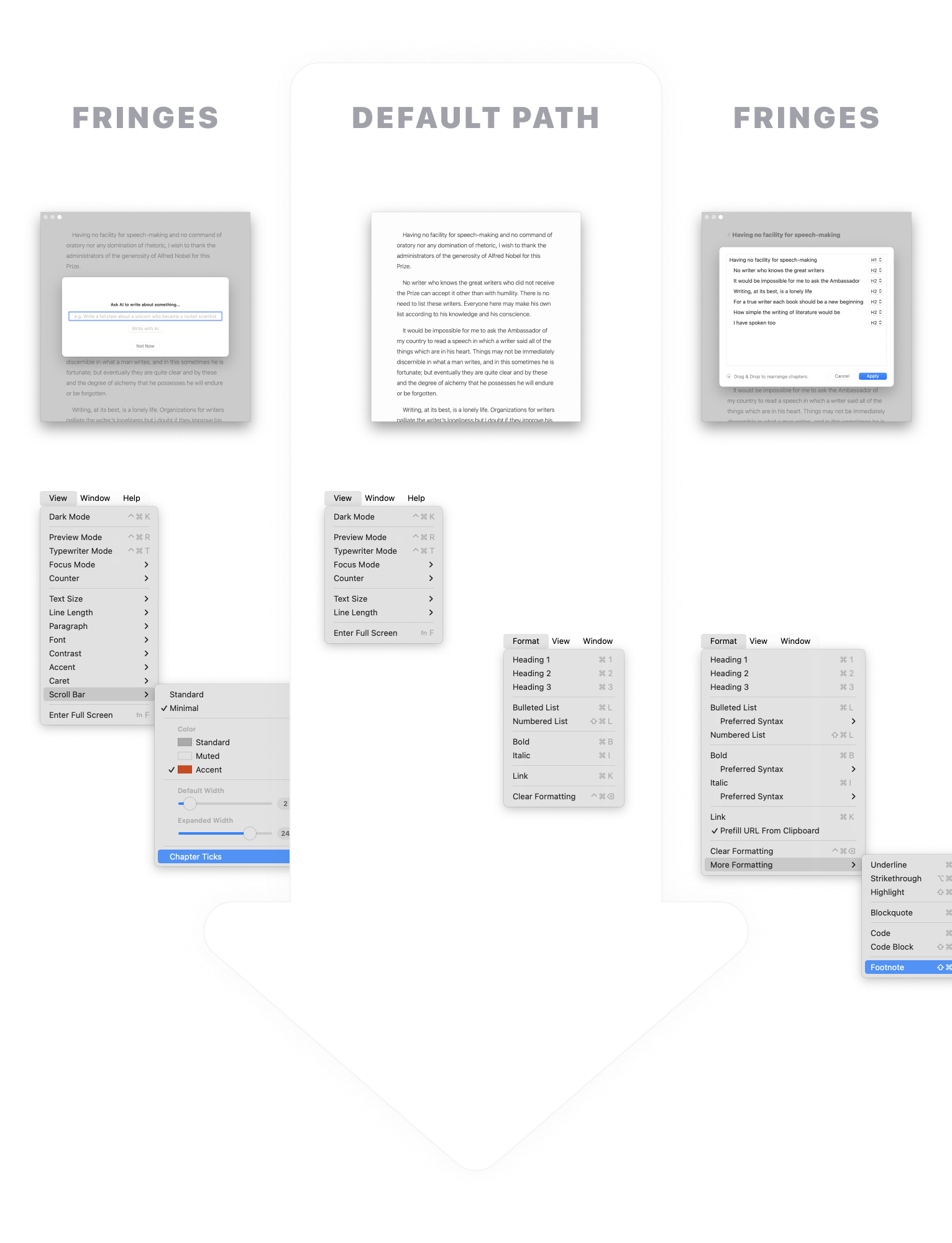
The slow pace and the overall limited number of features allow me to focus on building a better foundation, to better understand how things work together, and to avoid adding features that bring instability and a high maintenance burden in the future.
Closed-sourced native UI is a fragile place compared to the predictable JavaScript runtime of the browser. If you don’t invest substantial resources into refactoring your app and eliminating bugs — it’s death by a thousand crashes. And this is what I am banking on with regard to [1.]. The bloat, complexity, and bugs that [1.] accumulate from their decision to go mainstream present good opportunities to capture some of the disappointed users that eventually leave them.
This however may not be enough to make Paper into a viable product. There are simply not enough (reachable) people who need these kinds of ultra-simple writing apps (let alone pay for one). Power users are the ones who pay the bills because they need power tools to earn money that they can then justify spending on those tools. And while [1.] and [2.] are the majority, there definitely are cases of simple writing apps that remain simple and/or that are still supported by obsessive single players like me. There might just never be a big enough gap in the market for Paper. 🤷🏼♂️
Architecture
I find it convenient to think of Paper’s code as consisting of two scopes.
Application scope
Global stuff that exists as a single instance or is applied to the app as a whole.
- macOS menu
- iOS status bar
- Touch bar
- App icon
- Dark mode
- Input language
- Global app config
- Global app logic
- Single instance views
Document scope
- A collection of views and logic that live inside a view controller representing a single document.
- A new document scope spawns into life the moment the document is opened and dies when it is closed.
- Unlike a singular application scope, zero or more document scopes can exist at the same time.
The reality is a bit more nuanced as there are also scenes on iOS that subdivide the global scope, but the mental model holds more or less.
For every scope, I define a storyboard that serves 2 functions:
- It describes various views and widgets that are used within the scope.
- It acts as a dependency injection container that glues together all modules within the scope.
Modules (not to be confused with .modulemap stuff — I just happen to use the same name) in Paper are plain Objective-C classes that take responsibility for a piece of functionality within the app. It’s a way to group functionality related to a particular feature instead of spreading it across multiple places.
Modules have a well-defined lifecycle:
They are created by the storyboard when the main thing within the storyboard gets created.
Application scope
- The main thing is the app itself, so all modules are created on startup.
Document scope
- The main thing is the view controller that holds the editor.
They have a setup method that gets called after the dependencies have been injected, but before the main thing becomes visible.
Application scope
Called on
ApplicationDidFinishLaunchingNotificationUISceneWillConnectNotificationfor scenes
Document scope
- Called on
didMoveToWindowof the main view.
- Called on
They have a tear-down method that gets called before the main thing is destroyed.
Application scope
- No need. Modules die with the app.
Document scope
- Called on
willMoveToWindowof the main view when thenewWindowargument isnil.
- Called on
Modules declare their dependencies — views and other modules.
@interface TvTextAttributeModule()

@property IBOutlet NSTextView *textView;

@property IBOutlet TvTextContentModule *tvTextContentModule;
@property IBOutlet TvLayoutAttributeModule *tvLayoutAttributeModule;
@property IBOutlet TvCaretModule *tvCaretModule;
@property IBOutlet TvTypewriterModeModule *tvTypewriterModeModule;

@end
I resolve them manually in Xcode.
Dependencies are then injected by the storyboard at runtime when the view controller is instantiated.
UIStoryboard *sb = [UIStoryboard storyboardWithName:@"Document"
                                             bundle:nil];
UINavigationController *ctr = [sb instantiateInitialViewController];
If a document-scoped module needs something from the application scope it can get it from the global variable…
[self.viewController.presentingViewController dismiss_:^{
  [self.docNavigationBarModule documentViewControllerDidDismiss];
  [Application.get.viewController.storeReviewModule tryAsk];
}];
…or from the root of the view hierarchy for scenes.
BOOL unread = self.rootViewController.supportChatModule.unread > 0;
UIImage *icon = [UIImage systemImageNamed:@"gear"];
UIImage *unreadIcon = [UIImage systemImageNamed:@"gear.badge"];
self.rightBarButtonItem.image = unread ? unreadIcon : icon;
Modules subscribe to notifications (pub-sub events between classes) during the setup phase of the lifecycle and unsubscribe during the tear-down phase.
- (void)addNotificationObservers {
  [self addObserver:@selector(windowDidResize)
                   :NSWindowDidResizeNotification
                   :self.window];
  [self addObserver:@selector(textViewDidChangeSelection)
                   :NSTextViewDidChangeSelectionNotification
                   :self.textView];
  [self addObserver:@selector(colorsDidChange)
                   :Colors.didChangeNotification];
}
Modules can let other modules know that something has happened. This is done through direct method calls rather than notifications to keep things simpler, IDE navigable, and faster.
UIEdgeInsets contentInset = self.calculateContentInset;
UIEdgeInsets indicatorInsets = self.calculateScrollIndicatorInsets;

self.textView.contentInset = contentInset;
self.textView.verticalScrollIndicatorInsets = indicatorInsets;

[self.docFrameModule textViewDidChangeInsets];
[self.tvTypewriterModeModule textViewDidChangeInsets];
Modules can ask other modules to do or to calculate something that those other modules are responsible for.
- (void)textViewDidAnimateCaretFirstAppearance {
  if (self.shouldCancel) {
    return;
  }

  [self.label centerIn_:self.docFrameModule.visibleFrame];

  [self animateIn:self.label :^{
    [Delay_ by:1.0 :^{
      [self animateOut:self.label :^{
        [self.label removeFromSuperview];
        self.label = nil;
      }];
    }];
  }];

  self.label.hidden = NO;
}
This leaves the delegates, view controllers, and views as proxies that notify modules about stuff that’s going on in the app and delegate everything to them.
- (void)insertText:(id)string replacementRange:(NSRange)range {
  [self.tvAutocompleteModule textViewWillInsertText:string];
  [self.tvTypewriterModeModule textViewWillInsertText:string];

  if ([self.tvTextAttributeModule textViewWillInsertText:string]) {
    [super insertText:string replacementRange:range];
  }

  [self.tvTextAttributeModule textViewDidInsertText];
  [self.tvTypewriterModeModule textViewDidInsertText];
}
All in all, the combination of modules and dependency injection through storyboards gives a nice mechanism to decouple and subdivide what would have been a giant document view controller and/or text view. Applying the same approach to the application scope gives the whole app a uniform structure that is a joy to work with.
Cross-platform code
AppKit and UIKit are both quite similar and annoyingly different in many places.
I employ 2 Objective-C features to work around the differences:
- Macros (this one is inherited from C)
- Categories
For example, in many cases, the difference comes down to NS vs UI prefix which I mitigate with this macro.
#if TARGET_OS_OSX
#define KIT(symbol) NS##symbol
#else
#define KIT(symbol) UI##symbol
#endif
Now, whenever I need to declare a view in a shared module I can simply type KIT(View) instead of NSView or UIView.
- (KIT(View) *)cloneCaretView {
  KIT(View) *view = [self createCaretView:self.caretFrame];
  [view.layer setNeedsDisplay];
  return view;
}
Besides that, I can use those #if statements to quickly add platform-specific code in shared classes. To make such code more readable Xcode even has a cool trick that deemphasizes the code that does not apply to the currently selected platform.
Categories in Objective-C are a way to add new methods to any existing class, including framework classes (categories can also be used to replace methods, which is both powerful and scary 😵). I use them to harmonize the API. So if a method in UITextField is called text and in NSTextField it is called stringValue I can add a stringValue method to UITextField that calls text (or vice versa). Now I can always refer to the stringValue method in my KIT(TextField) variable and it will compile on both platforms.
I gather all these little patches to an adapter header in the shared library.
@interface UITextField(SharedApplicationAdapter)

@property (nonatomic) NSString *stringValue;
@property (nonatomic) NSString *placeholderString;

@end
And then implement this header in respective app projects.
@implementation UITextField(SharedApplicationAdapter)

- (NSString *)stringValue {
  return self.text;
}

- (void)setStringValue:(NSString *)stringValue {
  self.text = stringValue;
}

- (NSString *)placeholderString {
  return self.placeholder;
}

- (void)setPlaceholderString:(NSString *)placeholderString {
  self.placeholder = placeholderString;
}

@end
By the way, I also use categories to shorten long framework methods.
@implementation UIViewController(Mobile_)

- (void)dismiss_ {
  [self dismissViewControllerAnimated:YES completion:nil];
}

@end
The underscore at the end helps to avoid clashes with public or private methods that Apple might decide to add in the future. Apple often prefixes private methods with an underscore, so having it at the end makes more sense.
Debugging
Throughout my career I’ve always learned the quickest and the most about a particular third-party dependency by reading the code rather than going through the docs. Documentation is fine to get a general picture, but the details matter especially when stuff does not work the way it should either by (undocumented) design or due to mistakes of the authors.
Now in the case of Apple frameworks, documentation is sadly the only readable option you have. A far less readable one is to put a breakpoint in your code and examine the compiled stack trace of the framework.
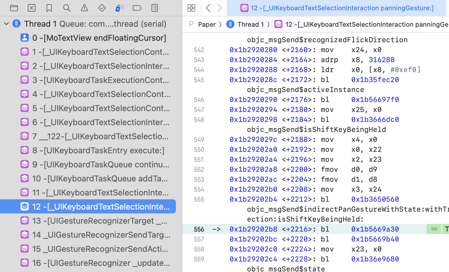
It looks like gibberish, but the important thing is that the method names are visible. Analyzing the flow of method calls is enough to grasp what is going on. And if you need to inspect something that is outside the stack ending in your source code you can always add a symbolic breakpoint to stop inside the framework. For instance, below it stops at recognizedFlickDirection which is visible at the top of the compiled code above.
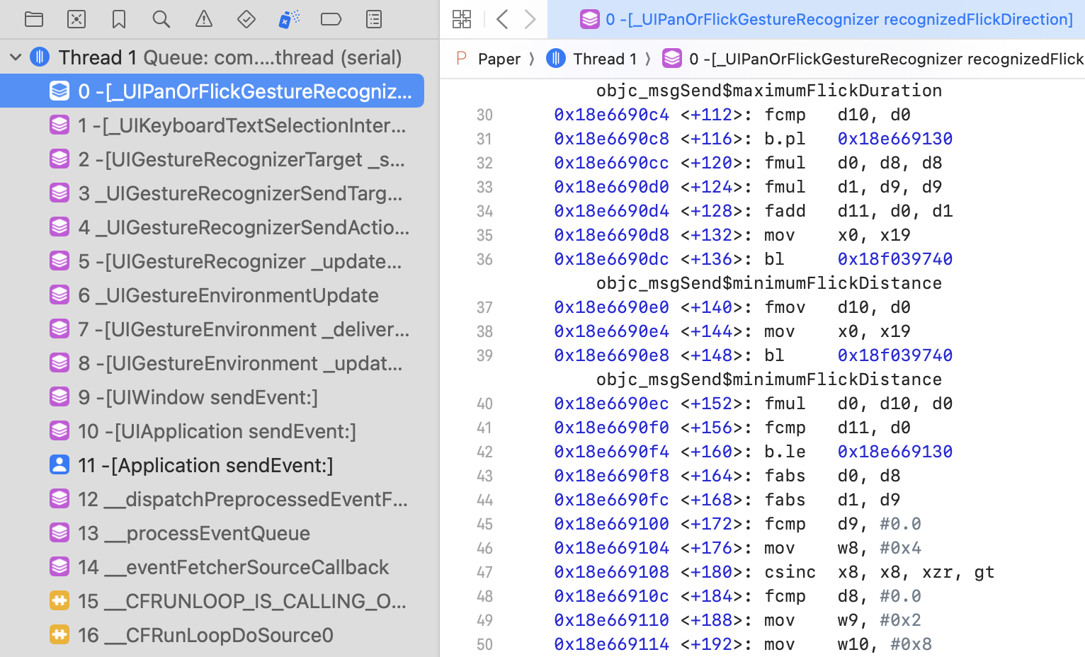
As a side note, going through a 30-year-old codebase you occasionally discover gems such as if statements adjusting the logic of the framework depending on the (Apple) app that runs the framework, or instances of creative naming. 🙃

Paid features
Back in 2015–17, subscriptions were not a widespread thing yet in the App Store. Pay-to-download was (and is) common, but I did not think that someone would pay for an unknown app without trying it, so the one-time payment freemium seemed like the only option. At the same time, I did not want to just paywall the features or implement a custom time-based trial (only subscriptions have built-in trials in the App Store). I wanted something extremely user-friendly. Something that feels like you can push all the buttons and adjust all the toggles of the paid offering without limits, without needing to explicitly commit to a trial of arbitrary length.
My solution was to offer only cosmetic upgrades as part of the Pro offering — visual changes rather than functional features (e.g. file syncing or PDF exports).
I would then make them trialable for an unlimited amount of time. Users could test drive the features to see how they look and work and then buy the Pro offering if they thought that the features were worth it.
Of course, there needed to be a measure that prevented people from using the features indefinitely without paying. At first, it was a 60-second timer that would nag them to buy if at least one of the Pro features was active. This proved to be too annoying, so I tied the nagging to characters written instead. It made more sense — try everything for as much time as you want without distractions but as soon as you start using Paper to write then every couple of hundred characters you would see a popup.
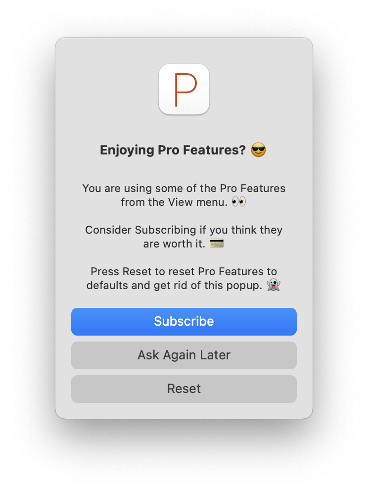
Why does this work only for cosmetic upgrades? Because, unlike functional features whose value is tied to a specific momentary action, cosmetic upgrades enhance your writing experience on a constant basis. You cannot put a functional feature behind the same frictionless trial described above since the value of the feature is fully realized the moment the action is performed. On the other hand, letting the users apply cosmetic changes accompanied by a nagging mechanism gives them a taste of the enhanced writing experience yet limits the prolonged value of this enhancement. Forcing the purchase, yet not limiting the ability to fully explore everything on their terms before spending the money.
What do users think about it? Here are a few mentions in recent reviews.
…the fact that it lets you mess around with and test pro features instead of locking them behind a paywall (a reason I do not like a lot of apps. They don’t let you try the features until you start a subscription or trial you may very well forget about, if it even gives you a trial) is extremely nice. […] You don’t even have to necessarily trust me on it: jump in and try it yourself. It lets you test every single feature it has.
A very minimalistic app with great functionalities. It helps to focus on just writing. I like very much the dev's approach –to let all the PRO features browsable and testable– and I think more apps should do the same.
Pricing
Paper started with 2 one-time payments of $5 each for 2 sets of Pro Features. Today, after many experiments, it is $3–30 per month or $50–200 lifetime for a single set (prices vary based on the purchasing power of the region).
First, before plunging into the world of subscriptions, I experimented with one-time payments. I started gradually doubling the price and observing if the total amount of money earned would increase or decrease. My App Store traffic was pretty stable, so there were always new people coming through the door who did not know anything about previous prices. That’s when I first discovered that people were willing to pay up to $100 for an app from an unknown developer. I tried going up to $200. I think I’ve gotten like 1 or 2 sales and some amount of complaints over several months so I figured that $200 is probably the pain point. Thus the market has decided that $100 is an adequate price for Paper (a lot of time and inflation have passed since and recently I decided to try $200 once more).
Next after a lot of hesitation, I decided to introduce subscriptions. “No one would pay a subscription for such a simple app” — was my conviction. But I was wrong. They worked and today Paper has a healthy mix of monthly, annual, and lifetime payments with subscriptions being the default, promoted payment option (since SaaS is all the rage, right?).
Even now I still experiment with prices. Recently I doubled the monthly price for new subscribers in some countries while keeping the annual price unchanged. This is to incentivize the annual option and to reduce churn. Preliminary results show that people continue subscribing though in smaller numbers. Still — this could be a positive change taking into account the higher monthly price and annual upgrades. We’ll have to wait and see…
What’s also great about the App Store is that you can easily test lowering prices for countries with lower incomes. Since Apple does not charge the typical ¢50 per transaction (e.g. like Paddle) you can go as low as you want without those fees eating into your margins. Currently, I am testing to see if lowering the price has any effect or if people in those countries simply don’t pay for software (or text editors 🤷🏼♂️) no matter what.
Gnarly stuff
Text editors are hard…
Text is one of those things that always gets things bolted onto it. Copy-paste, drag and drop, undo, caret interactions, right-to-left languages, non-alphabetic languages, dictation, spoken text, scanned text, non-text objects in text, data format recognizers, tap-and-hold link previews, text search overlay, spell check, autocorrection, autocomplete, AI suggestions — it never stops. You’re always at the mercy of the next OS update adding new ways to insert, update, and interact with editable text.
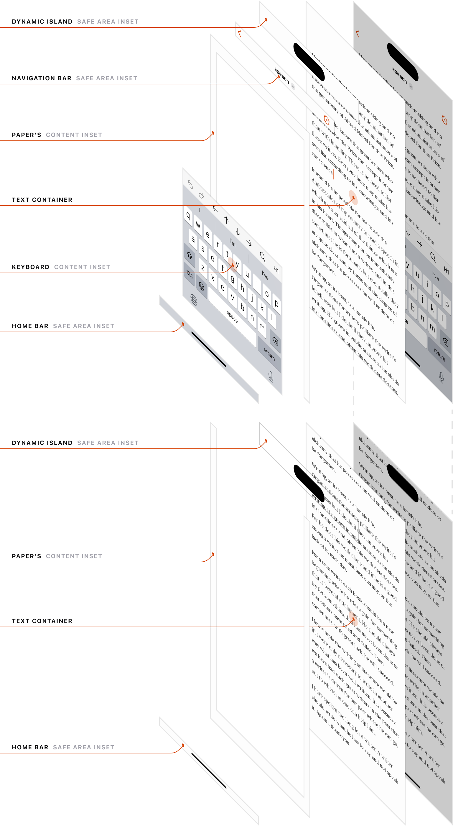
Figuring out the math behind the text editor rectangle is particularly tricky on iOS with various factors like the Dynamic Island (or the notch), the Home Bar, and the dynamically appearing software keyboard, times 2 orientations, getting in the way.
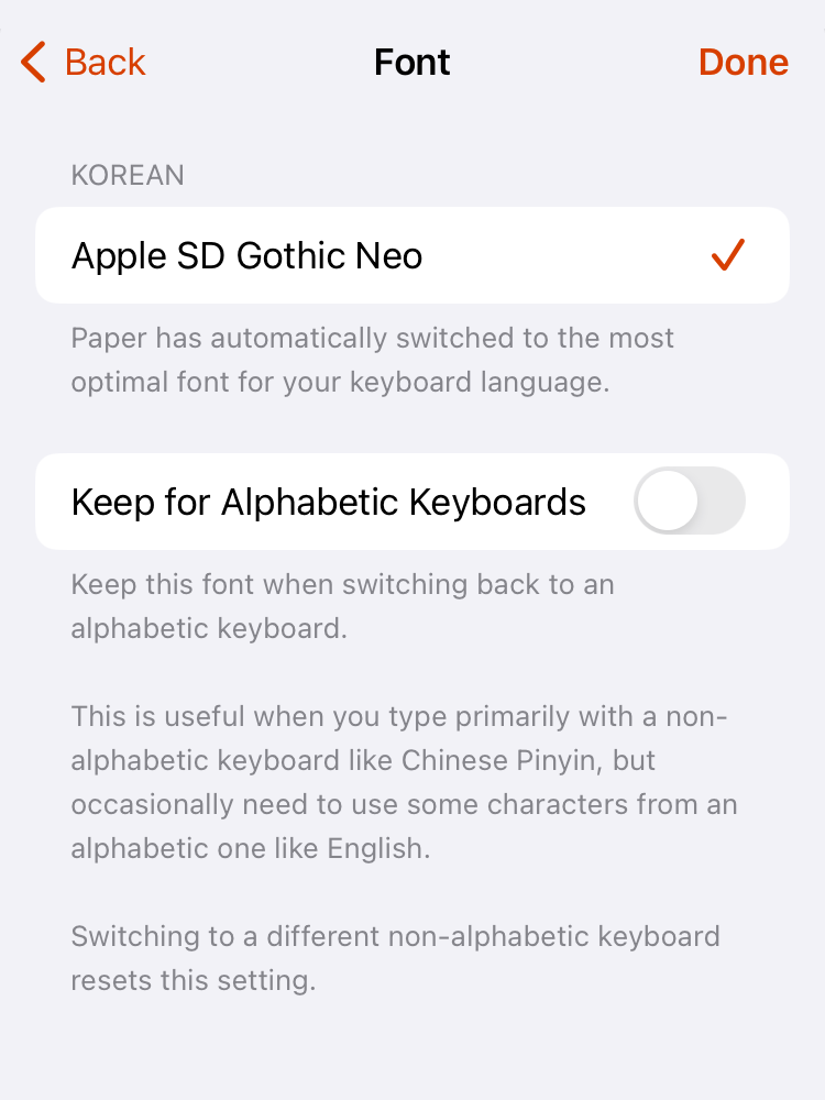
Input languages and fonts are a headache as well. Alphabetic languages are relatively easy to deal with as most major fonts support even quirky glyphs like umlauts and Cyrillics. The non-alphabetic languages however need specific fonts to display their glyphs. Luckily Apple’s systems come with at least one of those fonts preinstalled per every non-alphabetic input language. The only problem is that no API maps an input language to supported fonts — so I had to brute force it. I’ve installed every input language on my Mac and wrote some text in each of them in TextEdit to see what font TextEdit falls back to when it sees the typed glyphs. The following switch is the result of it (I am pretty sure I’ve messed up the names of some languages or nationalities — don’t judge me too hard, I am just a developer 😩).
switch (inputLanguage) {
  case InputLanguage_Alphabetic:
    switch (fontName) {
      case FontName_Courier:
        return @"Courier";
      case FontName_CourierPrime:
        return @"CourierPrime";
      case FontName_CourierPrimeSans:
        return @"CourierPrimeSans-Regular";
      case FontName_Menlo:
        return @"Menlo-Regular";
      case FontName_Helvetica:
        return @"Helvetica-Light";
      case FontName_Avenir:
        return @"AvenirNext-Regular";
      case FontName_NewYork:
        return @"NewYork-Regular";
      case FontName_Georgia:
        return @"Georgia";
      case FontName_TimesNewRoman:
        return @"TimesNewRomanPSMT";
      case FontName_Palatino:
        return @"Palatino-Roman";
      case FontName_BrushScript:
        return @"BrushScriptMT";
      case FontName_Charter:
        return @"Charter-Roman";
    }
  case InputLanguage_Japanese:
  case InputLanguage_Cantonese:
    return @"HiraginoSans-W2";
  case InputLanguage_ChineseSimplified:
    return @"PingFangSC-Light";
  case InputLanguage_ChineseTraditional:
    return @"PingFangTC-Light";
  case InputLanguage_Korean:
    return @"AppleSDGothicNeo-Regular";
  case InputLanguage_Arabic:
    return @"SFArabic-Regular";
  case InputLanguage_Thai:
    return @"Thonburi-Light";
  case InputLanguage_Hebrew:
    return @"SFHebrew-Regular";
  case InputLanguage_Hindi:
    return @"KohinoorDevanagari-Regular";
  case InputLanguage_Bengali:
    return @"KohinoorBangla-Regular";
  case InputLanguage_Malayalam:
    return @"MalayalamSangamMN";
  case InputLanguage_Burmese:
    return @"MyanmarSangamMN";
  case InputLanguage_Gujarati:
    return @"KohinoorGujarati-Regular";
  case InputLanguage_Kannada:
    return @"NotoSansKannada-Regular";
  case InputLanguage_Oriya:
    return @"NotoSansOriya";
  case InputLanguage_Telugu:
    return @"KohinoorTelugu-Regular";
  case InputLanguage_Gurmukhi:
    return @"GurmukhiSangamMN";
  case InputLanguage_Sinhala:
    return @"SinhalaSangamMN";
  case InputLanguage_Khmer:
    return @"KhmerSangamMN";
  case InputLanguage_Tibetan:
    return @"Kailasa";
  case InputLanguage_Armenian:
    return @"SFArmenian-Regular";
  case InputLanguage_Georgian:
    return @"SFGeorgian-Regular";
  case InputLanguage_Tamil:
    return @"TamilSangamMN";
  case InputLanguage_Amharic:
    return @"Kefa-Regular";
  case InputLanguage_Syriac:
    return @"NotoSansSyriac-Regular";
  case InputLanguage_Cherokee:
    return @"Galvji";
  case InputLanguage_Dhivehi:
    return @"NotoSansThaana-Regular";
  case InputLanguage_Adlam:
    return @"NotoSansAdlam-Regular";
  case InputLanguage_Hmong:
    return @"NotoSansPahawhHmong-Regular";
  case InputLanguage_Inuktitut:
    return @"EuphemiaUCAS";
  case InputLanguage_Lao:
    return @"LaoSangamMN";
  case InputLanguage_Mandaic:
    return @"NotoSansMandaic-Regular";
  case InputLanguage_MeeteiMayek:
    return @"NotoSansMeeteiMayek-Regular";
  case InputLanguage_NKo:
    return @"NotoSansNKo-Regular";
  case InputLanguage_Osage:
    return @"NotoSansOsage-Regular";
  case InputLanguage_Rejang:
    return @"NotoSansRejang-Regular";
  case InputLanguage_HanifiRohingya:
    return @"NotoSansHanifiRohingya-Regular";
  case InputLanguage_OlChiki:
    return @"NotoSansOlChiki-Regular";
  case InputLanguage_Tifinagh:
    return @"NotoSansTifinagh-Regular";
  case InputLanguage_Wancho:
    return @"NotoSansWancho-Regular";
  case InputLanguage_Punjabi:
    return @"MuktaMahee-Regular";
}
I then detect the selected input language and set the font accordingly.
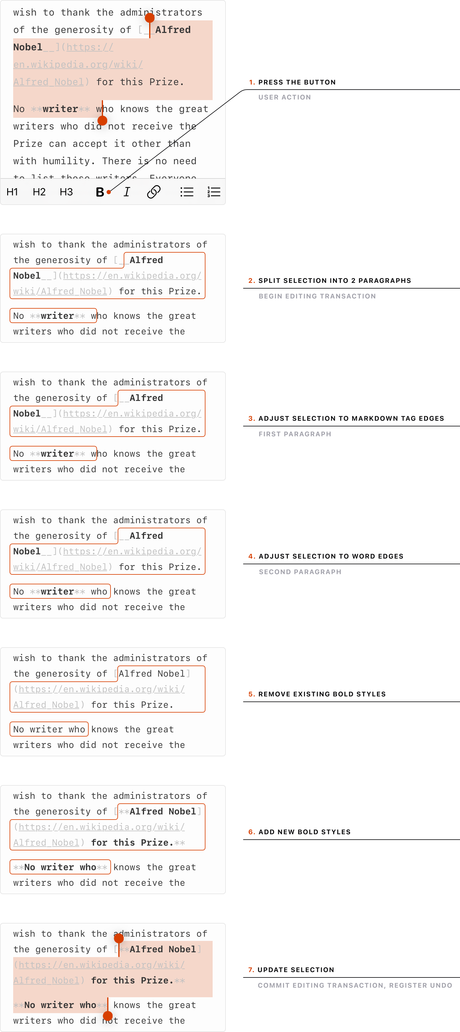
One more thing worth mentioning is the fiddly logic of batched text updates e.g. shortcuts that toggle Markdown formatting on a selected piece of text. A naive solution is straightforward, but coding for all the edge cases to avoid breaking the Markdown can be a pain.
Gimmicks
A thing I’ve picked up from the amazing Things app is the delightful resize bounce.
After a lot of trial and error, this is the damping logic that I’ve landed on.
NSRect frame = self.window.frame;

if (self.isMinWidthReached) {
  if (NSWidth(frame) > self.window.minSize.width) {
    self.minWidthReached = NO;
  }
} else if (NSWidth(frame) == self.window.minSize.width) {
  self.minWidthReached = YES;
  self.minWidthFrame = frame;
  self.minWidthMouse = NSEvent.mouseLocation;
}

if (self.isMinHeightReached) {
  if (NSHeight(frame) > self.window.minSize.height) {
    self.minHeightReached = NO;
  }
} else if (NSHeight(frame) == self.window.minSize.height) {
  self.minHeightReached = YES;
  self.minHeightFrame = frame;
  self.minHeightMouse = NSEvent.mouseLocation;
}

CGFloat (^damp)(CGFloat) = ^(CGFloat delta) {
  return sign(delta) * 3.0 * log(pow(fabs(delta) / 30.0 + 1.0, 5.0));
};
CGFloat mouseDeltaX = NSEvent.mouseLocation.x - self.minWidthMouse.x;
CGFloat mouseDeltaY = NSEvent.mouseLocation.y - self.minHeightMouse.y;
CGFloat minWidthFrameX = NSMinX(self.minWidthFrame);
CGFloat minHeightFrameY = NSMinY(self.minHeightFrame);
CGFloat dampedX = minWidthFrameX + self.axes.x * damp(mouseDeltaX);
CGFloat dampedY = minHeightFrameY + self.axes.y * damp(mouseDeltaY);

[self.window setFrame:NSMakeRect(
  self.isMinWidthReached ? dampedX : NSMinX(frame),
  self.isMinHeightReached ? dampedY : NSMinY(frame),
  NSWidth(frame),
  NSHeight(frame)
) display:YES];
The tricky part was figuring out the combination of math functions that yield a realistic rubber band effect. 🤓
Another fun mathy feature in Paper is the rotate-to-undo gesture.
A lot of calculations are involved to make it happen, but at the core of it is this logic.
self.wheelView.frameCenterRotation = self.wheelViewRotation;

for (NSUInteger i = 0; i < self.wheelView.subviews.count; i++) {
  CircleView* undoItemView = self.wheelView.subviews[i];
  CGFloat scale = [self bottomPointPercent:i :-35.0 :180.0];

  undoItemView.alpha = [self bottomPointPercent:i :5.0 :20.0];
  undoItemView.layer.affineTransform = CGAffineTransformMakeScale(
    scale,
    scale
  );

  if ([self shouldWheelItemBeFilled:i]) {
    undoItemView.fillColor = [self wheelItemFillColor:i];
  } else {
    undoItemView.fillColor = KIT(Color).clearColor;
  }
}

- (CGFloat)bottomPointPercent:(CGFloat)wheelItemIndex
                             :(CGFloat)zeroRange
                             :(CGFloat)maxRange {
  CGFloat rotation = self.wheelViewRotation + wheelItemIndex * 15.0;

  while (rotation < 0.0) {
    rotation += 360.0;
  }

  return fmin(
    fmax(fabs(fmin(360.0 - rotation, rotation)) - zeroRange, 0.0),
    maxRange
  ) / maxRange;
}

- (BOOL)shouldWheelItemBeFilled:(NSUInteger)wheelItemIndex {
  return [self undoItemIndex:wheelItemIndex] >= 0
         &&
         [self undoItemIndex:wheelItemIndex] <= self.undoRedoCount;
}

- (KIT(Color) *)wheelItemFillColor:(NSUInteger)wheelItemIndex {
  if ([self undoItemIndex:wheelItemIndex] == self.redoCount) {
    return Colors.theme.floatingElementHighlight;
  }

  return Colors.theme.floatingElement;
}

- (NSInteger)undoItemIndex:(NSUInteger)wheelItemIndex {
  NSUInteger wheelItemCount = self.wheelView.subviews.count;
  NSUInteger highlightedIndex = self.redoCount % wheelItemCount;
  CGFloat fullWheelTurns = floor(self.redoCount / wheelItemCount);

  return floor((fullWheelTurns - 0.5) * wheelItemCount)
         +
         (wheelItemIndex < highlightedIndex ? wheelItemCount : 0)
         +
         wheelItemIndex;
}
Arc used to use the phrase Gift Arc to a friend in their app-sharing feature — this felt right up Paper’s alley.
I have no idea if this next one has any effect on sales, but in any case — I show the total number of Pro users, the positive delta since the last time the user saw this number, and the annual plan savings (which may differ per country or change on-the-fly due to pricing experiments).
The delta number is considered seen when it becomes visible on the screen. So it can sit there, unseen for a long time, and then display a big delta once the user has scrolled to it.
Moving on to the super gimmicky territory — this animation is triggered when the screen goes to sleep while Paper is in the foreground. 💤
Lastly — something I’ve noticed in the world of Mac apps is that despite the attention to detail in the app itself the About window almost always gets zero love. Why not make it a little bit more fun? 👨🏻🎨
(roughly in the dimensions of a business card)
Tidbits
I’ve gathered a few smaller details that did not fit into other chapters but are worthy of mentioning nonetheless.
Details such as the disappearing hints in menus. The idea stemmed from the need to explain certain features or to hint at certain shortcuts in the menus. Like with many other things in Paper, my only constraint was — no extra (permanent) visual weight in the interface. To satisfy the constraint I decided to count the number of times the user has seen a particular hint and then never show it again after a certain number of views.
Speaking of reduced visual weight — sometimes a UI element needs to draw a bit more attention until it’s clicked, but after that, it should fade into the background to avoid distracting the user.
The next tidbit came from the need to nudge people to do certain things in the Mac app. I asked myself — “What would be the least annoying way to ask the user to do something while they are using the Mac app?”. The best idea that I came up with was to put it at the top of each menu. The thinking was that if you made your way into the menu, you anyway take a small mental break, so I would not be taking you out of your flow with my asks. I also made sure to show the nudge only after a certain period of active usage of the app, and with a delay between the previous nudge, so they would not appear too often.
What kind of nudges are those? At various stages of Paper’s life, these included:
- Letting them know that holding the ⌥ key reveals more menu items.
- Letting them know that the mobile app exists.
- Asking to rate the app in the Mac App Store.
Polls with 1 question and multiple answers.
- Removed. They worked great, but I ran out of things to ask at some point. 😄
Asking to share the app on Twitter.
- Removed. Did not work at all…
A fun technical side note — every time I need to store the state of a hint or a nudge or some other UI bit, I use the ubiquitous key-value store. It’s an iCloud store that is linked to the user’s Apple ID, and where every App Store app can save small amounts of data that sync across the user’s devices. This way I can ensure that the user does not see the same UI bit twice on different devices (or fresh installations of the app).
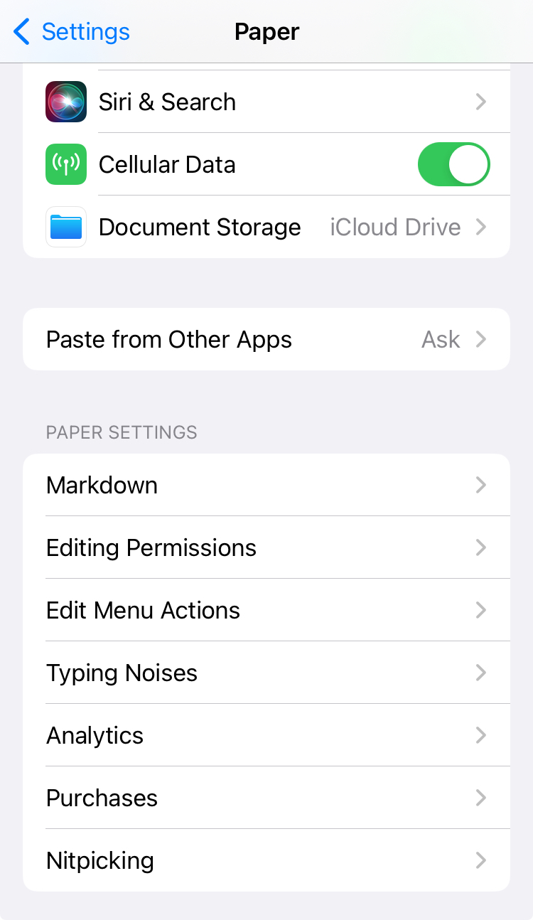
The final tidbit is the ultimate manifestation of the fringes vs default path approach. I have a hidden place in the app where I dump all the settings that are useful for (and were requested by) only a small group of users. I call this section Nitpicking. By moving them out of sight, I am not cluttering the UI for the mainstream users while at the same time keeping the nitpicky users happy.
In the Mac app, this is an alternate menu for the About menu item.
In iOS, the Settings app felt like the perfect place for this.
Feedback
Back in the day, Paper was using an app lifecycle management platform called HockeyApp. The Mac version of HockeyApp came with a hosted support chat that you could easily launch from within your app. Because this chat was so accessible, people were leaving useful feedback in vastly greater numbers compared to email.
Then came Microsoft, bought HockeyApp and turned it into AppCenter, sunsetting this feature in the process.
After going back to the desert that is feedback via email I decided to build the support chat myself for both platforms and integrate it to be a beautiful part of the app experience rather than something tacked on as an afterthought.
I tried mimicking the aesthetic of the Messages app on respective platforms down to those little curvy tips on chat bubbles.
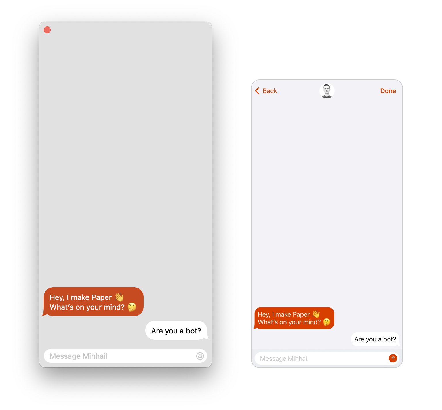
Unlike HockeyApp which required an email to get started, I decided to lower the friction to zero to maximize the feedback potential. I was fine to trade lower entry barriers for more spam.
For the backend, I wanted something hosted and free so I ended up saving conversations to UUID.json files on Dropbox.
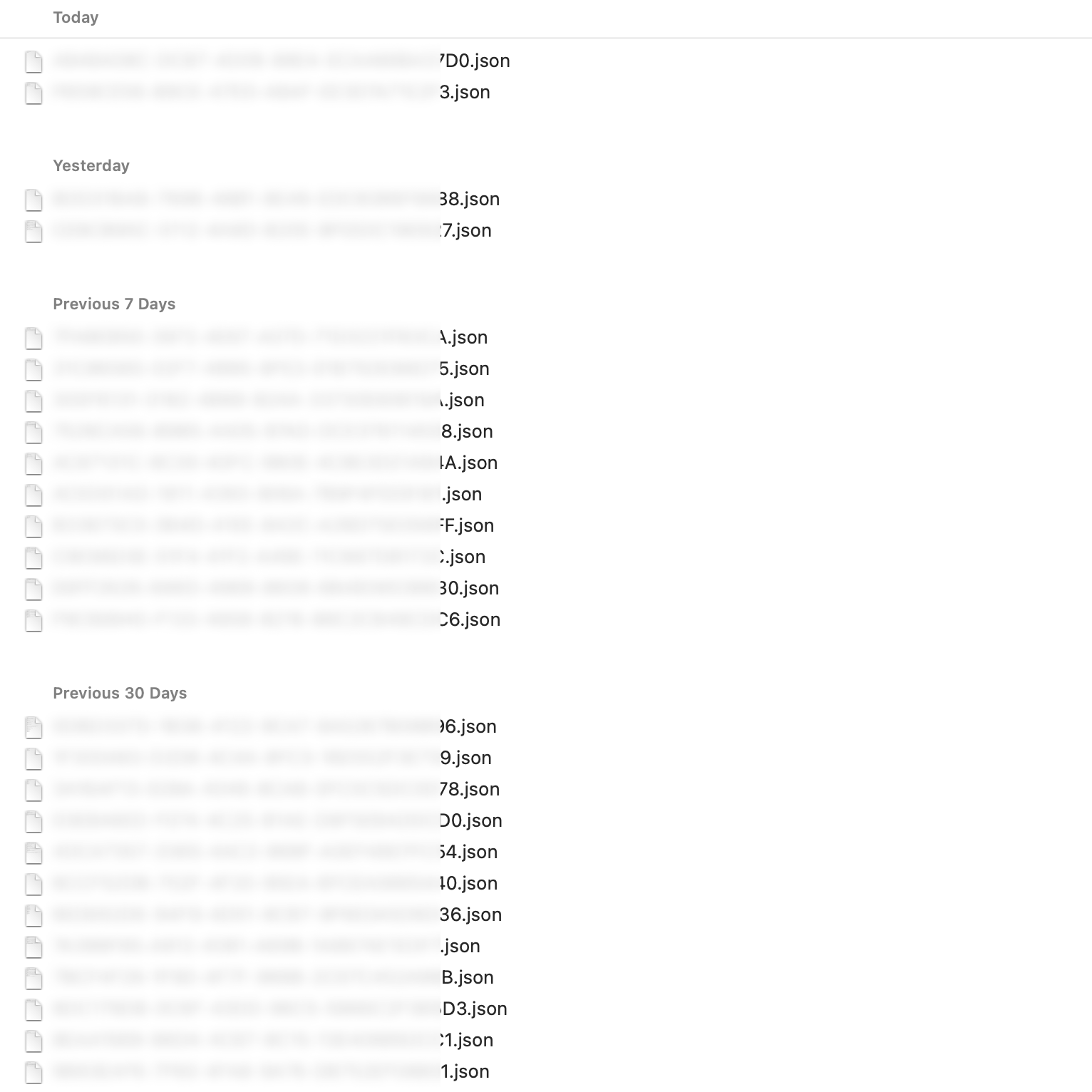
I edit those files in a text editor and it syncs back to Dropbox. Looking back, I should have simply built it on top of a Slack workspace. Nevertheless, Dropbox has worked well and still works great for me.
With time I even spotted a few clear patterns and coded the logic that looks for keywords both in the unsent message box and in the last sent message to show auto-replies as soon as the user has typed the needed keyword. Now I rarely get these questions — they are answered before the send button is pressed.
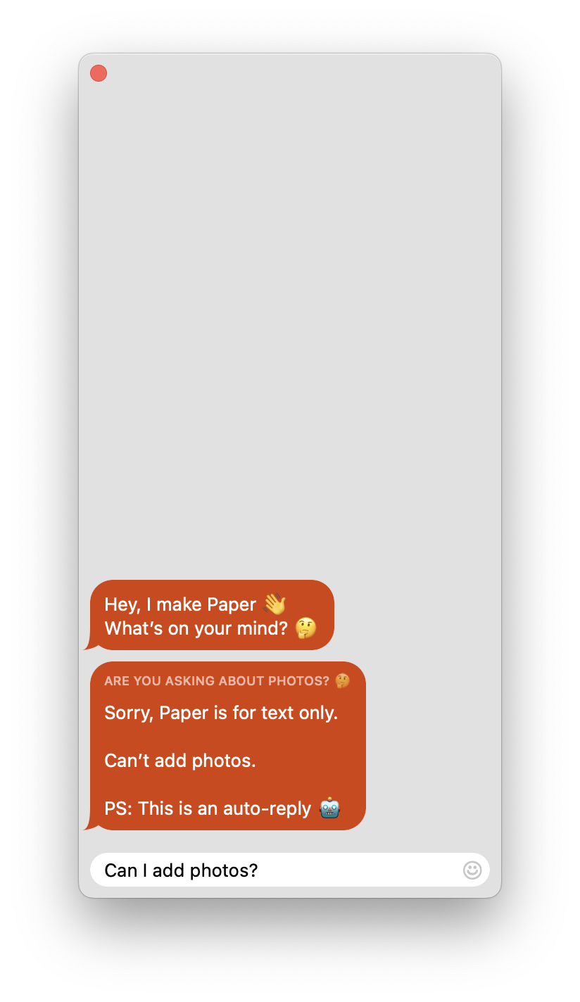
Oh, and of course I can’t answer at night. 😴
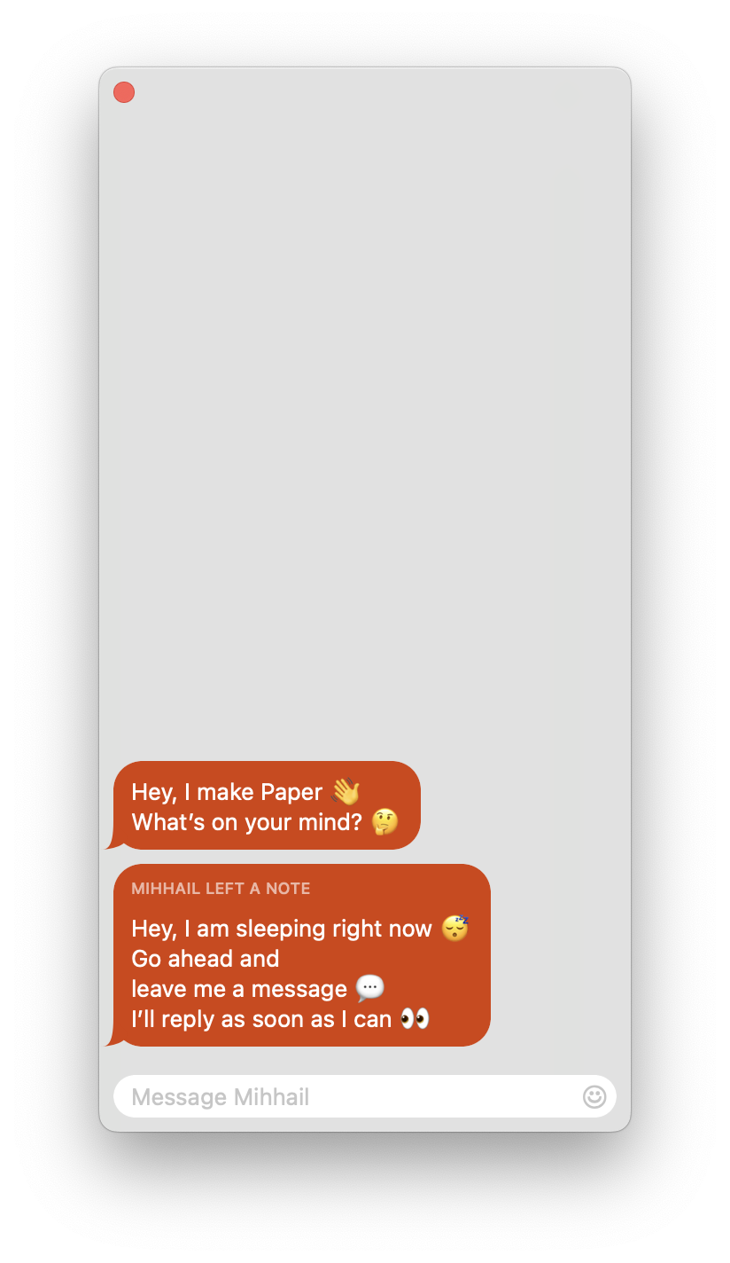
In the end, building a polished, frictionless support chat was one of the best decisions that I have ever made for Paper. Not only did it differentiate the app from the rest (unlike the web, live chats in native apps are not a thing, especially in tiny apps like Paper), but also resulted in happier (and often positively surprised) users, faster feedback in case of bugs, and a lot of great ideas. In fact, at some point, 90% of my roadmap started being informed by ideas from the chat.
Releases
So I’ve gathered and implemented the feedback from the chat. How are the features then propagated to the users?
About once a month I release one flagship feature that goes into release notes. Often I prepare multiple features during a development streak and then drip them out one at a time over the next months. This gives me the highest chance that someone would actually read the single sentence that is present in the release notes every month.
Bug fixes, tweaks, and smaller features go into releases usually without being mentioned. As a developer, you might feel better about putting “We’ve fixed some bugs and made a few performance improvements” into your release notes, but the average user of a niche, unknown app like Paper has no patience to care.
If an urgent fix is needed — I simply copy-paste the previous release notes to keep the flagship feature advertisement going. I do not mention the fix at all.
For the version number, I use a single monotonically increasing number. It’s the simplest thing so why complicate it with 2+ numbers separated by dots?
And here is the template that I use for the release notes.
Dear User,
One sentence. Two–three in rare cases.
Pleasant update,
Your Paper
A bit cringey, but I kinda like it. 🫠 It’s like every month the app sends you a letter explaining what’s new. Some users have even mentioned this as a thing they look forward to.
Having something to release every month be it small or big is what greases the flywheel of App Store distribution.
It shows the current users that their subscription is worth it.
It signals to potential users that the app has been recently updated.
It tells the App Store algorithm that the app is not abandoned.
And finally, this slow and steady pace is what allows me to keep this thing going for years to come.
Acknowledgment
Early on in Paper’s life, an artist and a fan of Paper reached out to offer his services.
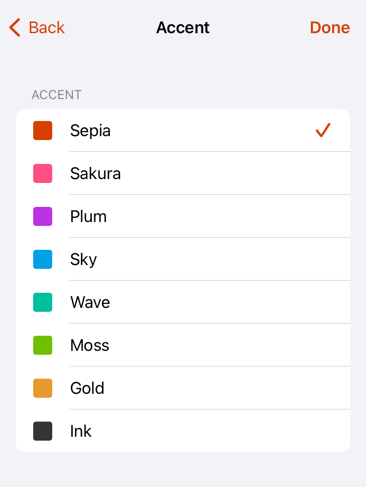
The most prominent result of our collaboration is Paper’s palette of accent colors. Especially the signature Sepia color that was inspired by sepia ink.
Hats off to Ben Marder for his help. 🎩
As we’ve reached the end of the article, something I simply cannot leave unmentioned is that at one point Paper was printed in a physical magazine. For a software developer, it is a pretty surreal experience to have your digital code manifest in real life like that. 🤤